


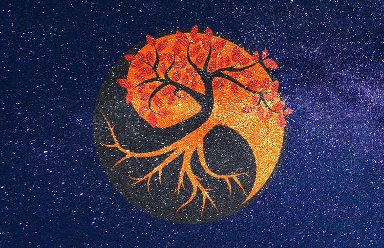


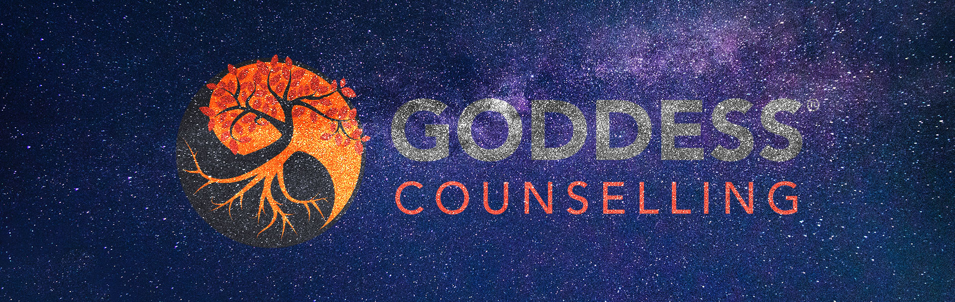

The Yin & Yang symbol works so well with the tree and the roots that the client expressed a keen attachment to – it represents them as sharp but compassionate, bright but thoughtful, introverted but interested, enduring but respectful.
The colour palette is earthy but bright and the over-all feeling is solid and natural, which I think summed the client up quite nicely!
The client says:
I love my logo and the whole process was fascinating. Trudie patiently asked me about myself and the business, then picked the perfect colours from that! I had the opportunity to choose from a selection and we got to one that was excitingly perfect. I thoroughly recommend her! My partner has also been really impressed and will look you up when he’s ready to get his logo updated for his tarot organisation business too. I think you’ll get a trickle of magical mystical logos to do now lol.